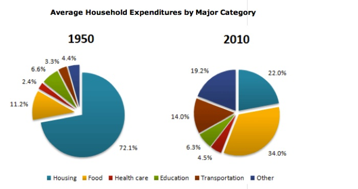
The pie charts below show the comparison of different kinds of expenditure of a household in two years (1950 and 2010). Summarise the information by selecting and reporting the main features, and make comparisons where relevant. Write at least 150 words.
Your essay
0 / 150 từHỏi Thầy Huy về cách viết bài này